

Brightening your home takes on a whole new dimension when illumination is symbiotic with decoration. Brighter interiors happens with bright lighting and bright lighting!?
Colours are getting bolder brighter and richer, designs modern crisp and graphic. Modern interiors include retro colour pops. Joyful childlike and fun.
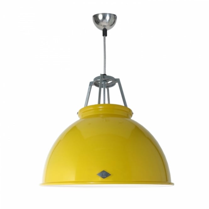
On a practical level your colour combinations can have impact on the level of light your space has. We’d suggest choosing your paint colours and light fittings to work together. Often we hear people say my rooms not bright enough, possible because the light fitment was an afterthought. The brightness of light is either absorbed or reflected depending on colours and surface of the material chosen to decorate.
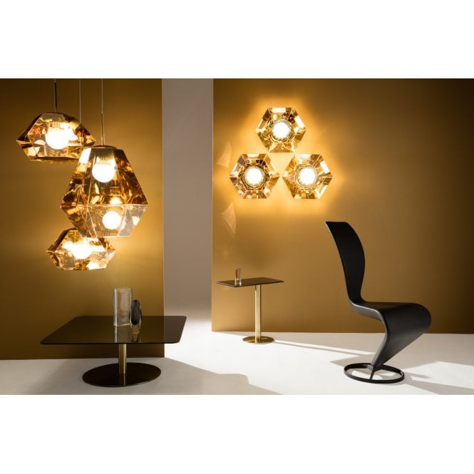
Colour is always used to personalise a space and colourful interiors are becoming more of a thing as we back away from bland, safe, some say overused colours. Zingy graphic newness is bursting onto our homesteads bringing a vibrancy and dynamic burst of vitality. The world of interiors seems to have languished in the shadows long enough grey, beige and greyish beige have been top of the popularity poles for so long. A new movement is rebelling against bland.

We adore the boldness of swathes of saturated rich pastels, or even primary colour pops. Being emboldened all seem appropriate once more. If you’d just love to brighten your grey home decor and are looking for an altogether brighter addition to the look there are a plentiful array of accessories to choose from but why not make your accessorising a lamp or light fitment: brighten you home completely.
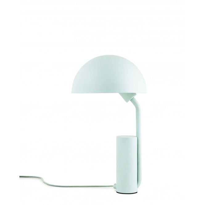
Remember how fantastic the pick and mix looked in Woolworths. (for youngsters this was a shop, it sold lots of thing but the sweets looked amazing, so tempting) This candy colour array was memorable. Sweetie colours are incredibly sensory, evoking memories, the childlike joy we all had once. It’s playful and calming in equal measure.
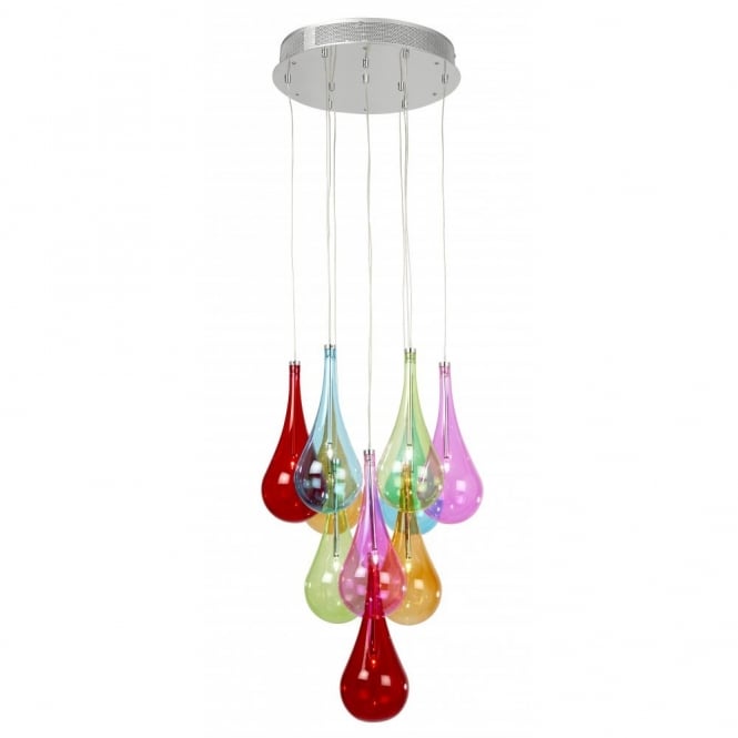
Pastels are a great choice for this but don’t feel constrained by colour be emboldened. Opposites clashing colours or tonally just a subtle shift.
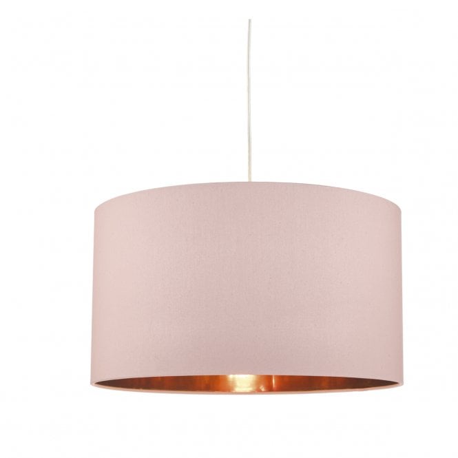
Colour within interior design isn’t new we’ve just forgotten about mixing the pallet as in recent times we’ve been told what we should have. You’ve only got to look at Pinterest or instagram and it’s a wash of grey. There’s not a thing wrong with a neutral pallet but for those who want to brighten and stand out from the grey there are more combo’s to consider.
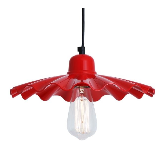
As I mentioned colour is not new over 100 years ago the Bauhaus movement saw colour and pattern as every bit as important as functionality and that form and function need not be bland.
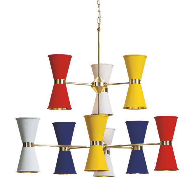
Blue and green have jostled for the top spot and with a variety of shades we’ve probably just withered about the smallest nuances of colourations. Now we have the chance to add colours with broader bolder brush strokes.
