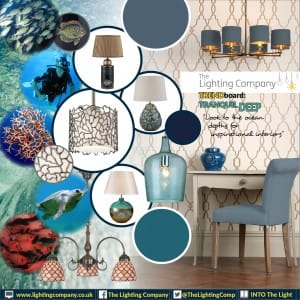
Trendboard – Tranquil Deep
Sand, sea and subtlety. The latest emerging trend looks out to sea for inspiration. Where sea sediment, coral, sea shells and pale blended colours of blue, green and turquoise transport us to paradise. Who could fail to be seduced by the soft delicate mix of sandy textures and pearly finishes that we see ebbing and flowing into interior design?
The calmness of this trend sees the look being utilised in homes with a particular relevance in bedrooms and bathrooms. This is where tranquility is the desired norm, but the look is great too for a luxury living room. Commercially it would be ideal to use in tearooms, boutiques and perfumeries. Within the hospitality sectors hotel bedrooms and fine dining rooms will benefit from the relaxed pale pallet. We’d suggest using a strong hit of contrasting deep rich sapphire blue for added impact. Speaking of blue you’ll see a lot more colour choices for blue this season. The Lighting Company have added some new silk shade options especially designed for the contract markets. They are the 3 blue tones “Delph Blue 79” a mid blue which teams well with many colours, the bold “Peacock 92” that’s almost a shimmery turquoise and the fore mentioned “Sapphire Blue 80”. This is a deep royal Sapphire that adds confident rich accents to a design.
Where does the trend come from? I guess it’s the same thing that collectively draws us to the sea. The sheer mystery and longing to be connected to nature. I guess that we’ve all been seduced by tech for such a long time and we’ve become used to the smooth perfectly produced world, we need an antidote. That antidote is, connecting again with the world around us. We no longer want so many smooth mass produced items around us, we want to touch the world we’re in. Interestingly this “being connected” see’s many people giving up owning lots of possessions and instead looking for experiences and novelties. On a recent trip to London I felt myself doing the same, on a quest for new experiences. As I’m not one for heights my experience days are not going to be skydiving, but I did allow myself to be talked into going to the top of the shard. It was wonderful, being so high I felt away from the hustle and bustle of below and found myself wanting to look up. The amazing thing is I should have been looking at the sights below. Instead up was where the space was, where I felt closer to nature. More connected!
The good news is creating a calm space within your home is fairly inexpensive. Here are a few things you will need, light colours (paints mainly), natural patterns like shell or coral and if you are using fabrics make it transparent opal and or shimmery. If you’re using wall paper opt for something with a washed out colour that adds to the tranquility. And a must is great lighting. The lighting should give a feeling of space, go for lighting that adds to the feel of the room. We’d add an odd spotlight here and there to highlight special objects, or perhaps a table lamp in a coral colour or texture. Remember this look is pared back calm, less is more. Box up anything that won’t work with the look you’re after, send it to the attic or garage. Clutter doesn’t bring calm.
Here’s some light inspiration.
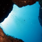
Bambou
The beautiful blues of the Mauritius depths can be replicated with your choice of paint colours and or accessories. Consider complimentary colours, the vibrant displays of coral reefs gives you the freedom to pair additional contrasting colours.
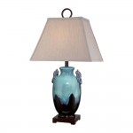
AMPHORA ceramic table lamp
The Amphora turquoise and brown ceramic table lamp with sand linen shade is a perfect fit for this trend. The textured shade and rich glazed base will have you feeling a stones throw away from the Caribbean tides.
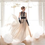
Pale Colour Pallet
Remember the result you’re looking for is tranquility, calm and relaxed. Keep things airy and work to a primarily pale colour pallet. If things become too dark and rich you’ll find it can begin to seem a little “loud”.
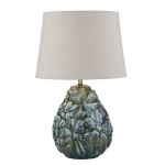
ENSA Table Lamp
A beautiful high lustre base table lamp which showcases tones of blue and green. Teamed with an ivory cotton shade this light would fit in well with the tranquil deep trend.
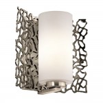
SILVER CORAL wall light
The clue is in the name as to why this light is a great fit. The neutral colours used make it easy to accommodate and the repeated pattern and texture adds character to any room.
Have you created a place of tranquility with this new trend? Feel free to send us a picture, we’d love to see your results! To view our full collection of Tranquil Deep lighting click here: Tranquil Deep Lighting.
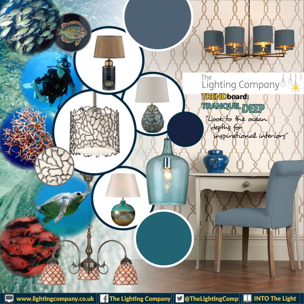
Trendboard – Tranquil Deep
It may interest you to know we have a FREE magazine full or inspiring content and ideas. Sign up to our newsletter below to receive your FREE copies now!