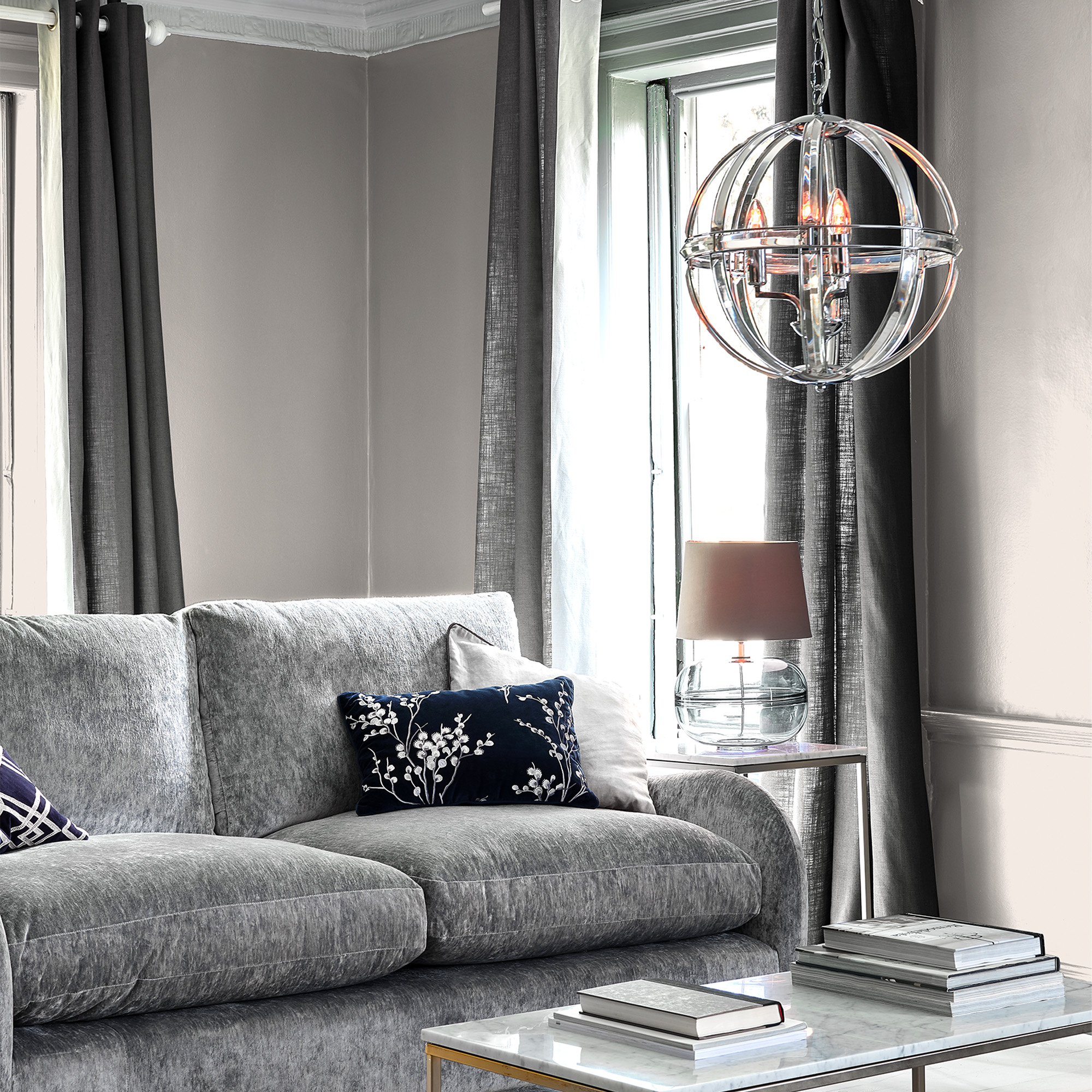
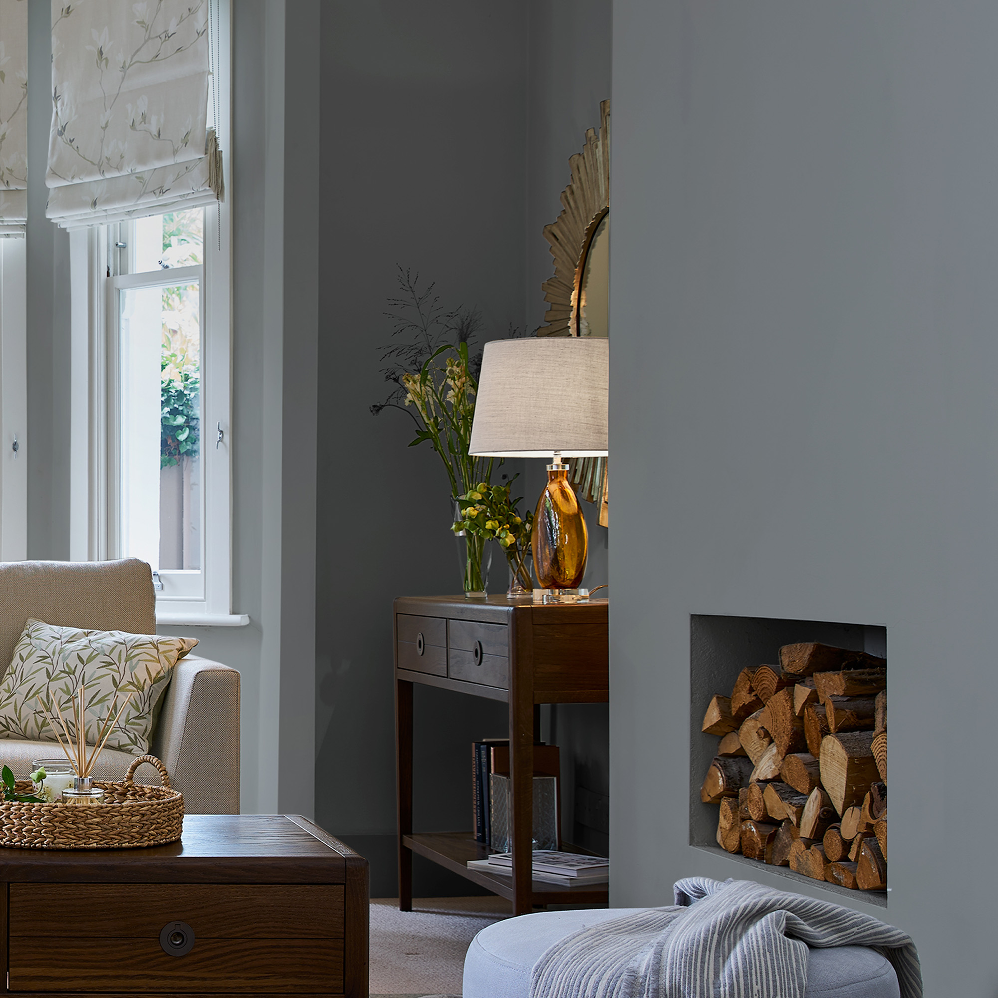
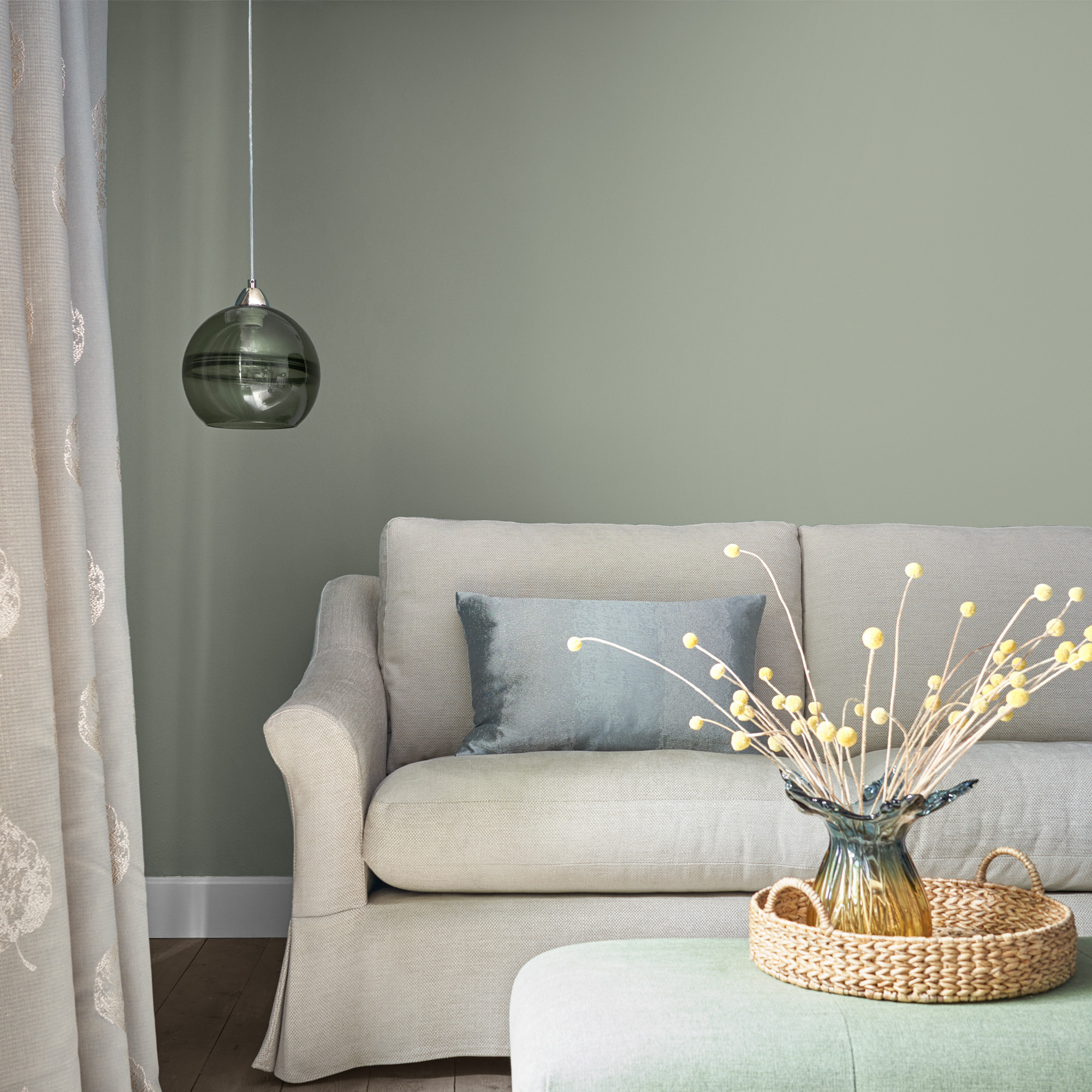
Choosing the perfect paints for your homes colour scheme can be an exciting process, yet a daunting one too. Especially when you’re trying to create a cohesive look that will last through many years.
Before you dive in, take a moment to think about how you’d like your space to feel. Colour is often linked to our emotions. You’ve sure to have heard phrases like being in a “grey mood” meaning a little down or “painting the town red! ”referring to a bold energetic outgoing mood.
Colour choice is more nuanced it isn’t simply pick a colour and set to with a paint brush. There’s colour combinations and colour matching to consider and this is where many DIYers start to feel uneasy. What seemed like an easy task quickly becomes a skill to master.
Worry not with a few we’ll have you co-ordinating and accenting with the perfect combo of colours in no time! To get you inspired why not view our gallery of interior decor idea’s or read on for the top tens tips for choosing the perfect paint colour.
View all paints.
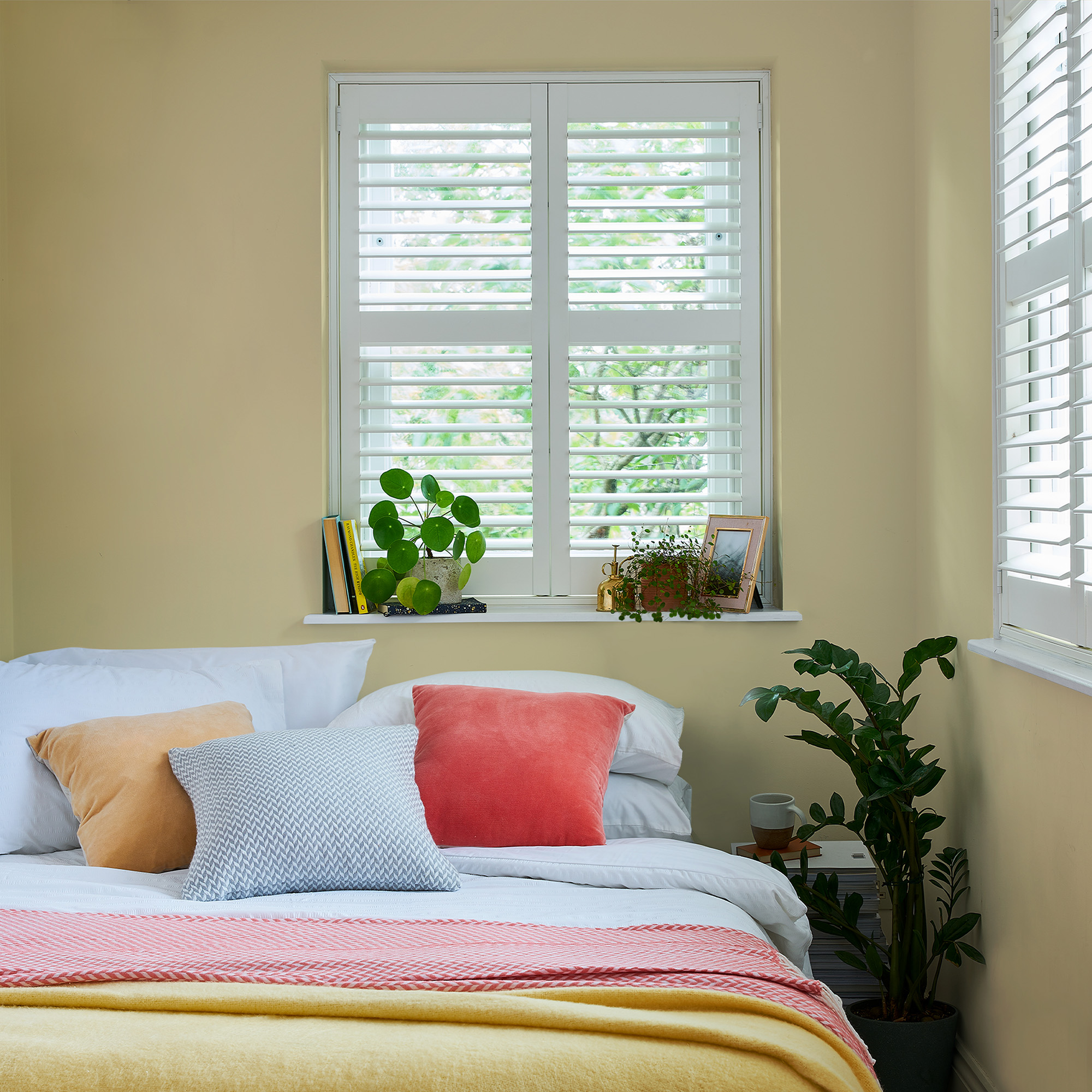
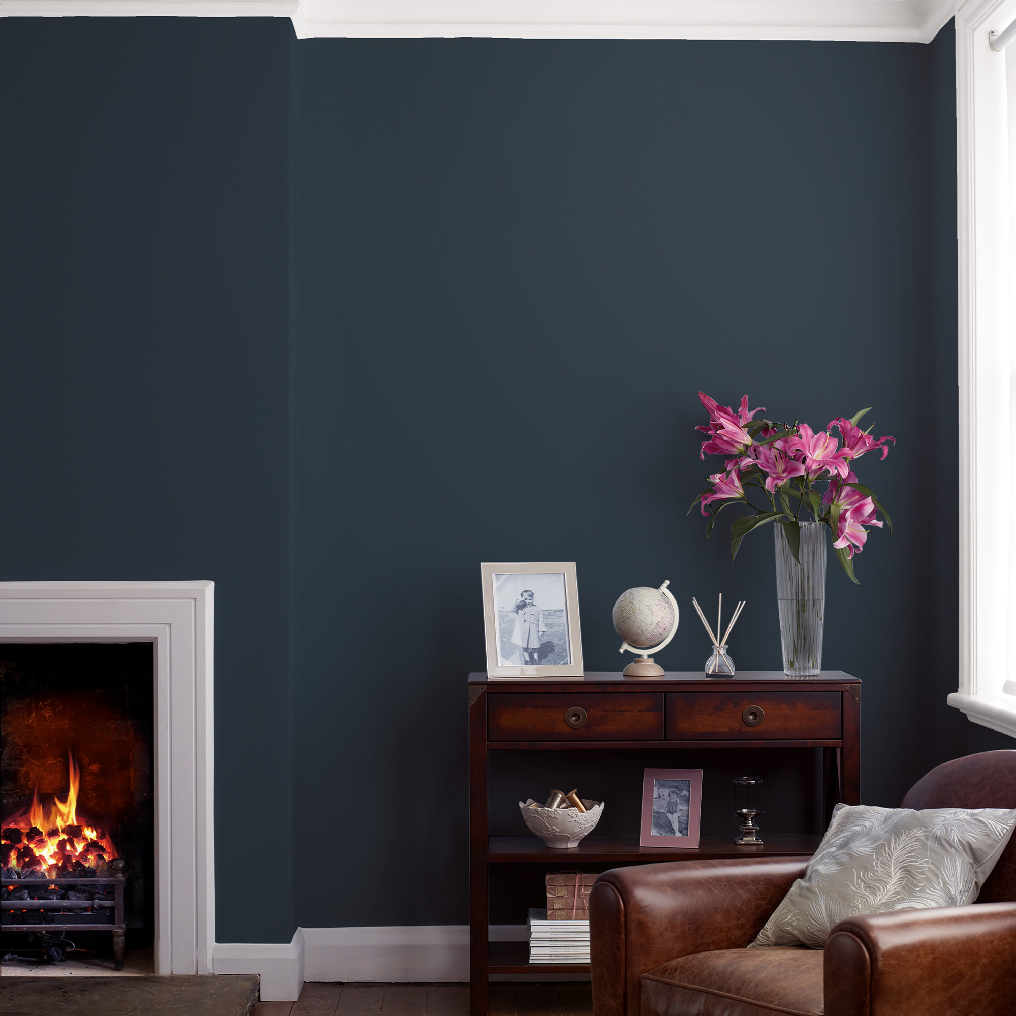
1. Start with the room itself.
If you are starting from scratch, the world is your oyster, anything goes. Think about what kind of mood you want to set in your living area. Do you want a calm, relaxing atmosphere? Or do you prefer a lively, energetic vibe?
View all paints and wallpapers.
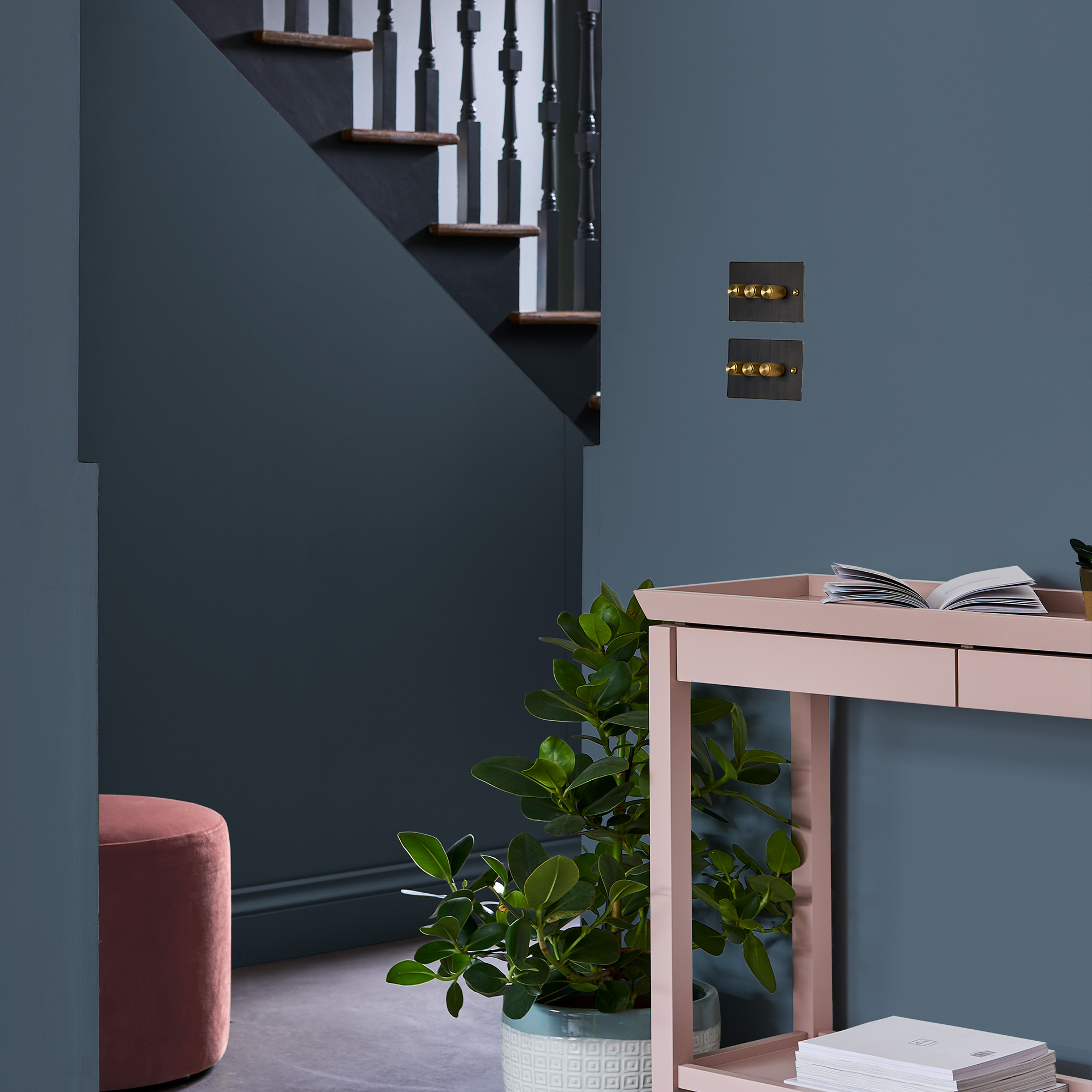
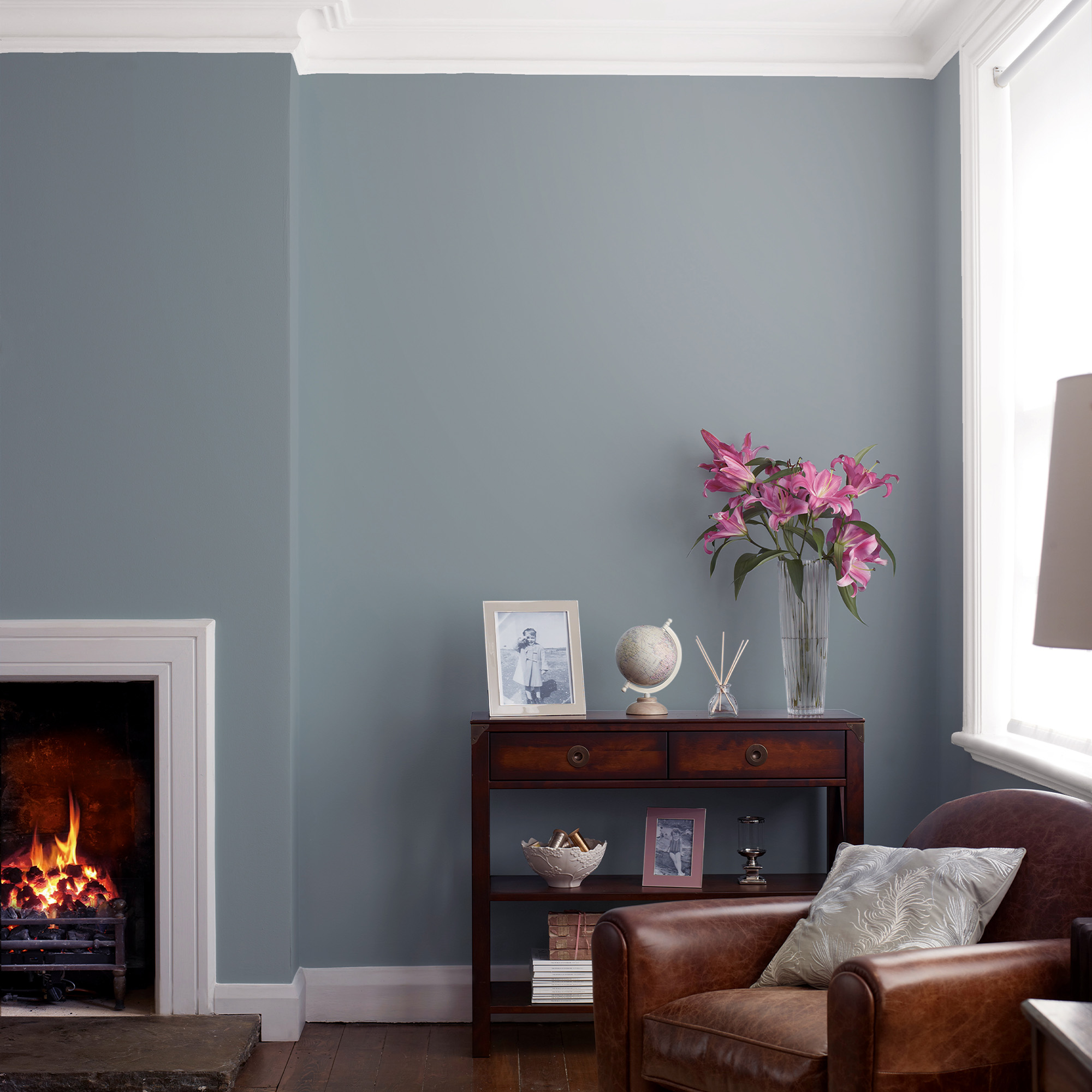
Calming colours tend to be pale pastels, the more saturated and stronger the colour it becomes more energetic. Very dark becomes introspective even secretive. For example a soft pale blue seems airy and wafting whilst a sapphire blue is bold and invigorating. It’s true of most colours the darker the more somber, private or enclosed it seems, this is not bad in fact dark colours are very popular. Darker tones are always associated with more luxurious lavish occasions they seem ‘of the night’, a time where all sorts goes on under the cover of darkness. In dark tones we feel we have privacy and this can be very relaxing.
2. Combine Colours to create a co-ordinated décor.
If you’re keeping some items in the room and not sure where to begin with regards to which paint colour go well together, try starting in the room itself.
What furniture or fabrics are staying? What colours do you see in them are there any colours that stand out?
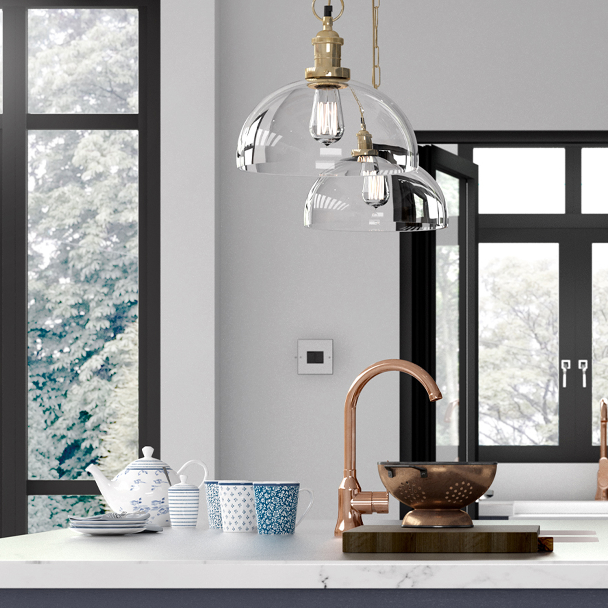
The dominant colour in the furnishings of fabrics could be an accent colour in your new scheme if there’s a small amount of that colour. If there’s lots of the same colour and it has to stay you can look at tone on tone décor.
One flat colour in a space may be great if it’s a flat white, no not coffee, I’m talking emulsion! A plain white room is bright and fresh the depth of interest comes from the furnishings and textures laid on top of the blank canvas.
3. Tone on Tone decorating trend.
This is where you’d have the same colour but different depth of colour for example, a shade darker in an alcove to gives depth and interest and a stronger bolder shade of the same colour as a feature wall.
4. Choose colours that complement each other.
If you’re painting your own room, choose colours that work well together. You might also consider using complementary colours, a mixture of colours always looks better than a single colour. 3 colours works really well. If you are unsure which colours look good together look for inspiration. Perhaps looking at a wallpaper will show you which colour in the design play nicely together.
5. Opposites attract
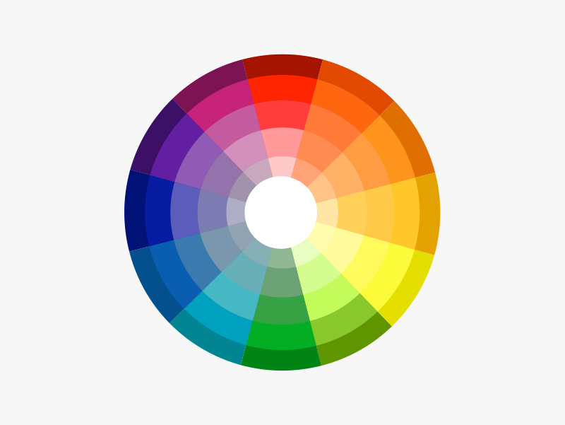
Adding some bold contrasting colours enlivens the look but which colours are contrast? Designers often use a colour wheel and the colour opposite your chosen colour is the contrasting colour. Black and white also contrast with most colours.
6. Take Advice.

Looking at images of rooms may inspire you at LightingCpmpany.co.uk you’ll find wallpapers are matched with complimentary co-ordinating paints. This is a great way to get a complete look without the headache of wondering if this goes well, they just do. Looking at wallpaper books often helps people find inspiration, even if you don’t want a wallpaper they do show really well which colour combo’s can sit in the same scheme.
Once you’ve decided on a colour scheme, about what you’ll painting. Will you be painting plastered walls yourself if so you’ll require an emulsion paint. If that wall is in a bathroom you may prefer a proper bathroom paint which fairs better in wet environments after all emulsion is water based and can be washed off. If you hire a professional painter and they are bringing the paint they’ll know this but if you supply the paint make sure it’s the right type for the material being painted.? How will you apply the paint? Roller or brush determines the finish. Cutting in, this is where you get a sharp edge between colours will require a brush whereas larger areas cover quickly when rolled.
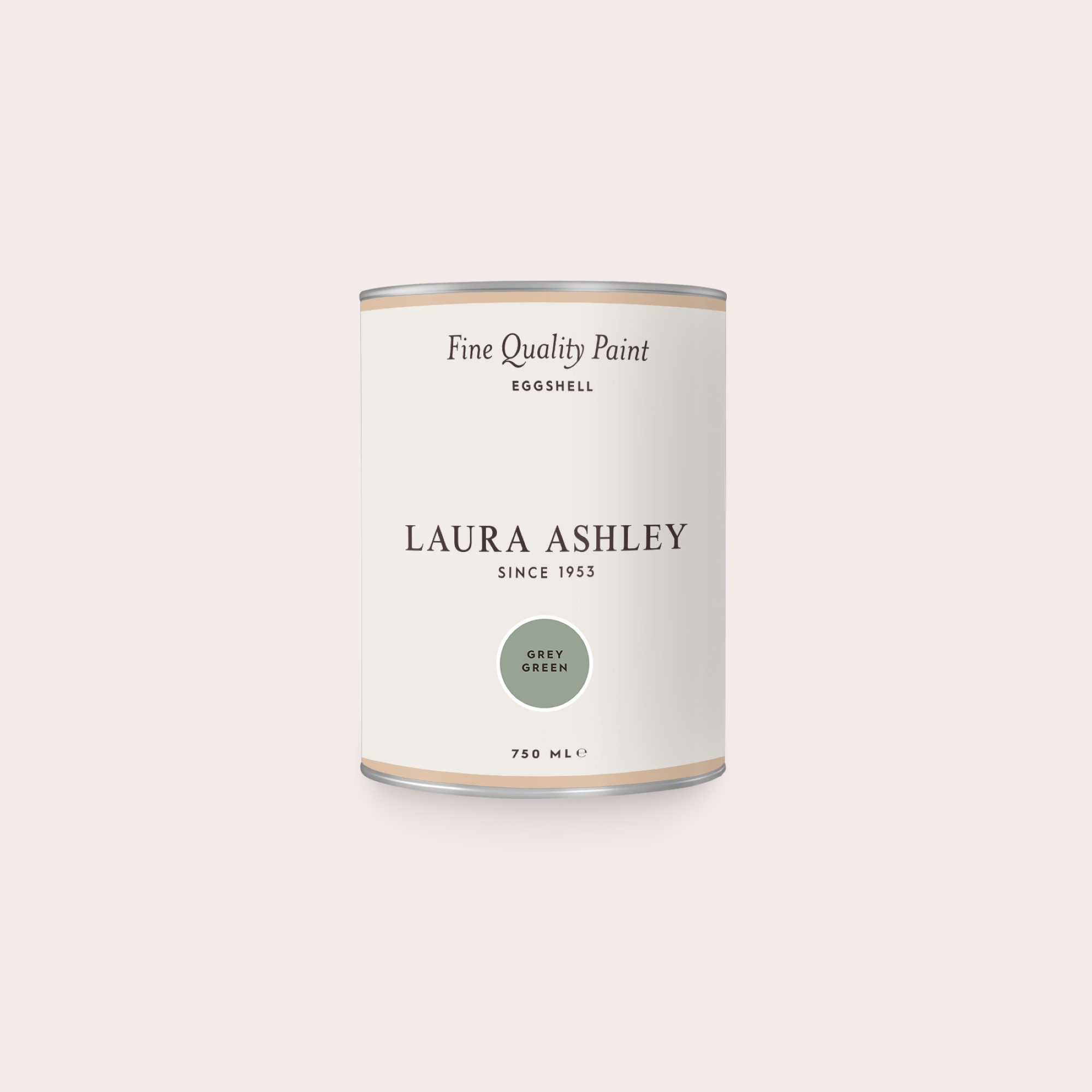
Gloss paints are suitable for wood and sometimes metals one such gloss we recommend is eggshell as it’s a semi matt gloss, not as shiny and we feel gives a nicer finish. You may be asking what is eggshell? A decorator will be able to give advice on all paint finishes as will paint and wallpaper suppliers.
Many of us want to try and paint the space ourselves, it’s cheaper, and with a little advice it’s a fairly simple job. That is if you are steady of hand and have some patience.
View Eggshell paints and Matt Emulsion paints.
7. Don’t forget the ceiling.
It’s easy to overlook the ceiling when choosing paint colours, but they play an important role in creating a cohesive space. They should complement the colour scheme of the room, but not necessarily match them exactly. The most popular ceiling colour is white but there’s no rule it has to be. In bedrooms as you look up at the ceiling you may prefer a variation, if you are bed bound a plain white ceiling may be less than stimulating, spice things up by choosing a colour or go a step further and wallpaper it. This turn the space into a much more dramatic picture.
8. Add some contrast.
If you’re going for a bolder look, choosing a colour with a strong hue and lighten it up by adding white contrasts. Or a feature wallpaper or mural. This will make the colour pop against the white, you may want to play with finishes too! Add metallic elements such as lighting, lamps, mirrors and objects to pep it up.

If you prefer a subtler approach, go for a darker shade and add a lighter tone to bring out its depth. A contrast colour or accent colour layers interest as do textures within soft furnishings, maybe bring in a little pattern. Cushions throws and wall art can do this without overwhelming they enliven a subtle scheme beautifully.
The Laura Ashley range of cushions, throws and wall art co-ordinates beautifully with paint and wall coverings worthy of exploring for a perfectly curated interior.
9. Using natural light to your advantage

Natural light is one of the brightest sources of light we have. Sunlight can change how we see a colour of paint on our walls. Using bright colours which can bounce the light such as white will make your room look a lot brighter. Or using dark colours will help reduce the light bouncing around. Look at the windows in your chosen room and see where the light falls and take into consideration the change of colour and brightness that it could affect.
10. The last work is always lighting.
Lighting the space well always brightens every decoration project the darker the colour you choose to put on the walls and ceiling the more light you’ll need. Level up you lighting plan by adding lamps. Table lamps show off the wall by bring light and picking up on the texture and what’s more they are super easy to install.